
Arezuart
Project
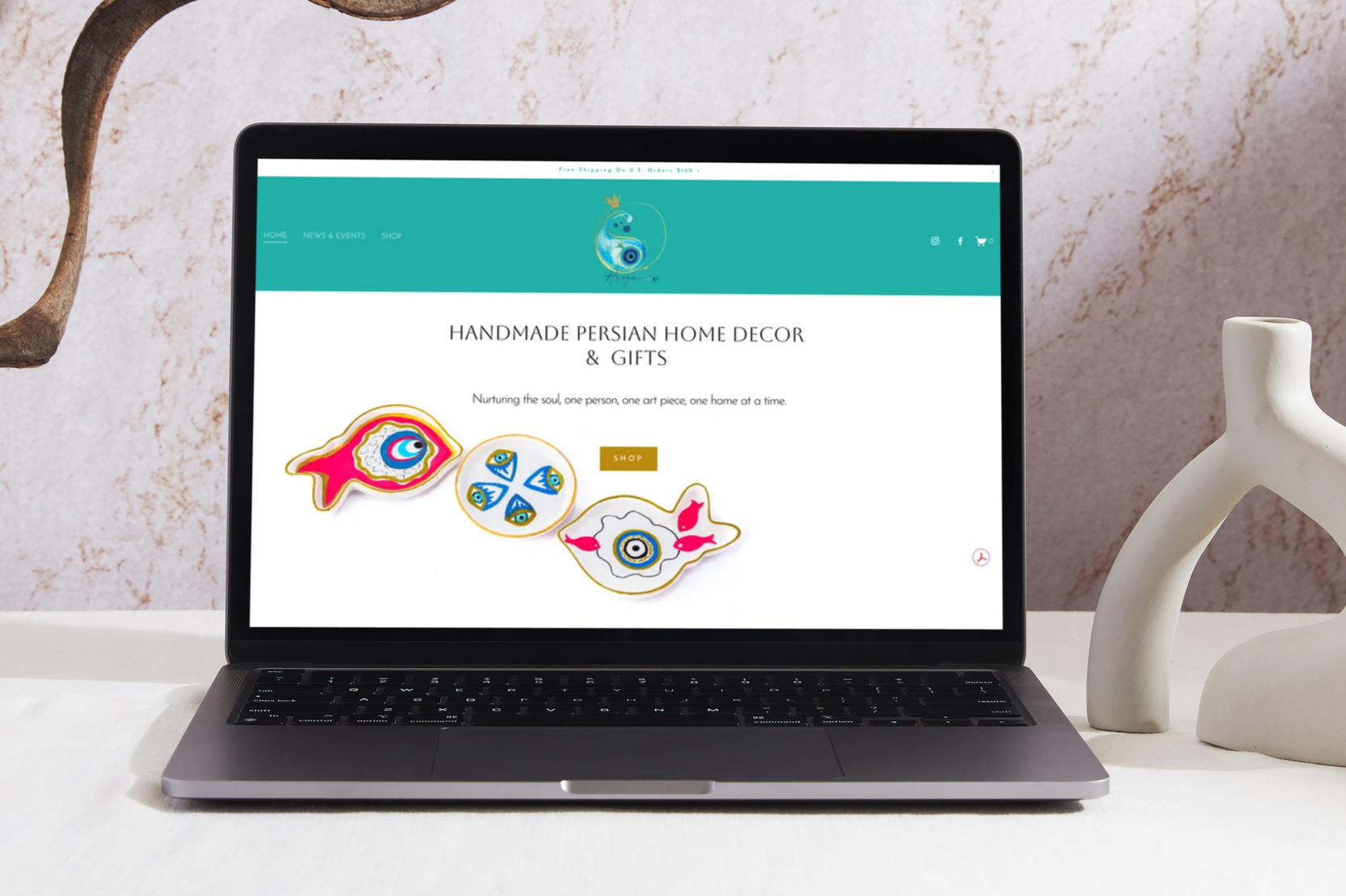
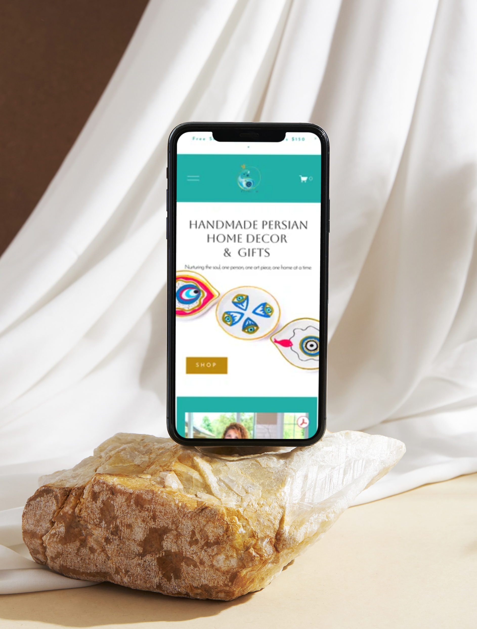
Arezu Art is a Persian-inspired handmade art and home décor brand built around cultural heritage, craftsmanship, and intentional living. Arezu's mission — to enrich people's lives through culture, creativity, and self-expression — shaped every design decision on the site.
Visit the site at arezuart.com
The client came in with a color direction and a clear aesthetic sensibility — minimal, warm, and modern. The palette was built around a true teal (#09A69D), gold, and near-black, keeping the focus on the handmade work itself rather than competing with it. Typography pairs Aboreto for headings — elegant and architectural — with Josefin Sans for body text, clean and modern. Together they balance cultural refinement with contemporary minimalism.
The project covered the full scope of bringing an e-commerce business online from scratch. Site architecture, page layout, and navigation were designed in Squarespace to support both browsing and buying. All copy was written from scratch — from the homepage tagline to product category descriptions — developed in close collaboration with the client so her voice came through at every touchpoint.
Product photography was edited for consistency across the shop — color correcting and standardizing images shot in different conditions so the catalog reads as cohesive and professional. All products were organized, categorized, and uploaded into the e-commerce system.
The logo came in after the site was already built and integrated cleanly into the established visual system without requiring changes to the overall design direction.


Color Palette:
White — #FFFFFF
Gold/Mustard — HSL 42, 85, 40
Teal — #09A69D (RGB 9, 166, 157)
Dark Navy — RGB 36, 39, 44
Black — #000000
Typography:
Headings — Aboreto
Paragraphs — Josefin Sans
Miscellaneous — Gruppo