
ICI SYSTEMS
Project
ICI Systems is a Washington DC-based IT solutions provider with over 20 years serving federal government agencies and commercial organizations. The original site was severely outdated — content scattered across a handful of pages with no clear structure, and a visual identity that hadn't kept pace with the company's established reputation.
The redesign started with architecture. The existing content was reorganized into a logical page structure — Home, Company, Services, and Contact — with six individual service pages built out for Cloud Services, Client Virtualization, Business Continuity, Network Services, Security Services, and Staff Augmentation. Each page was scoped with the owner to determine what needed a full explanatory section versus a concise overview, and the owner provided copy to fit those defined frameworks.
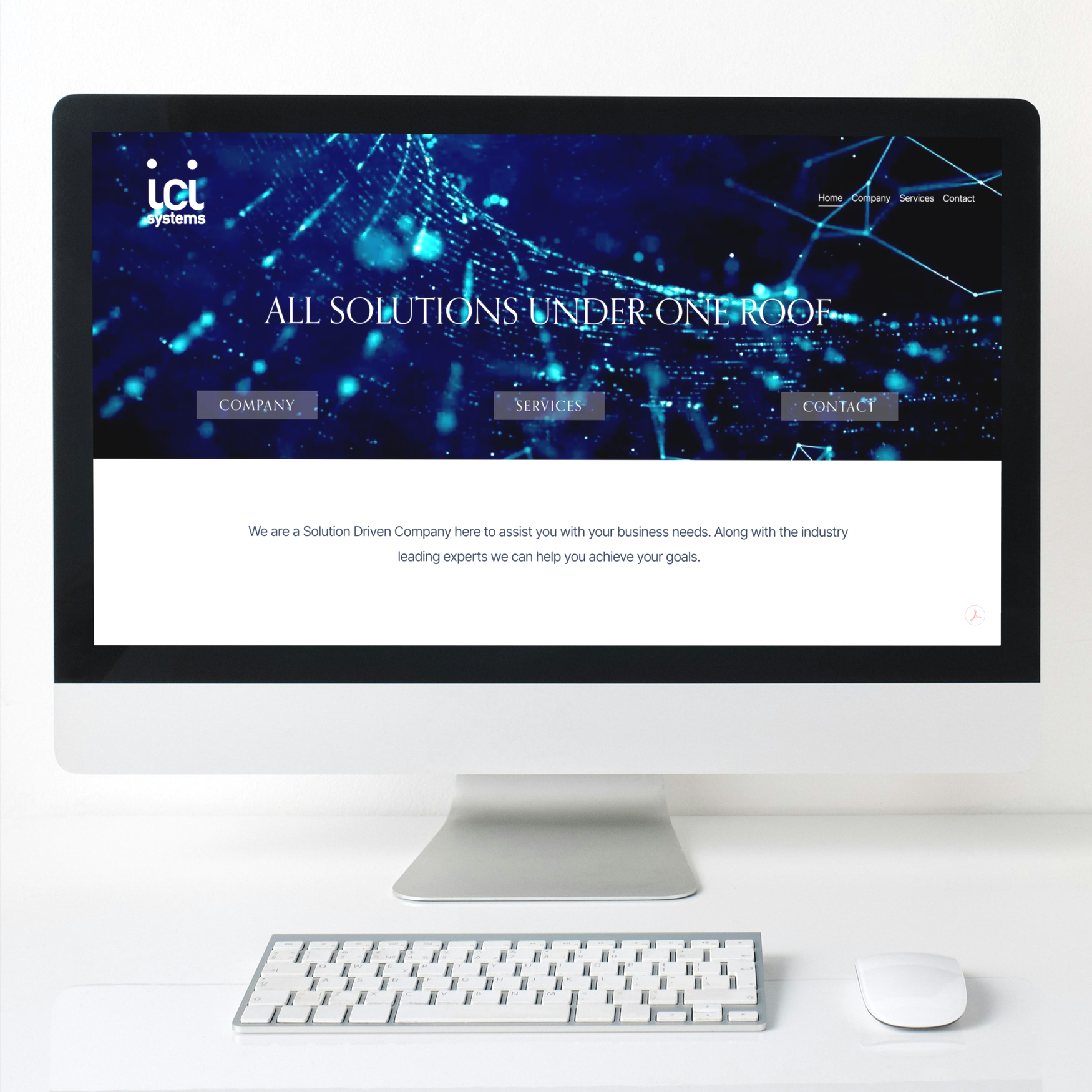
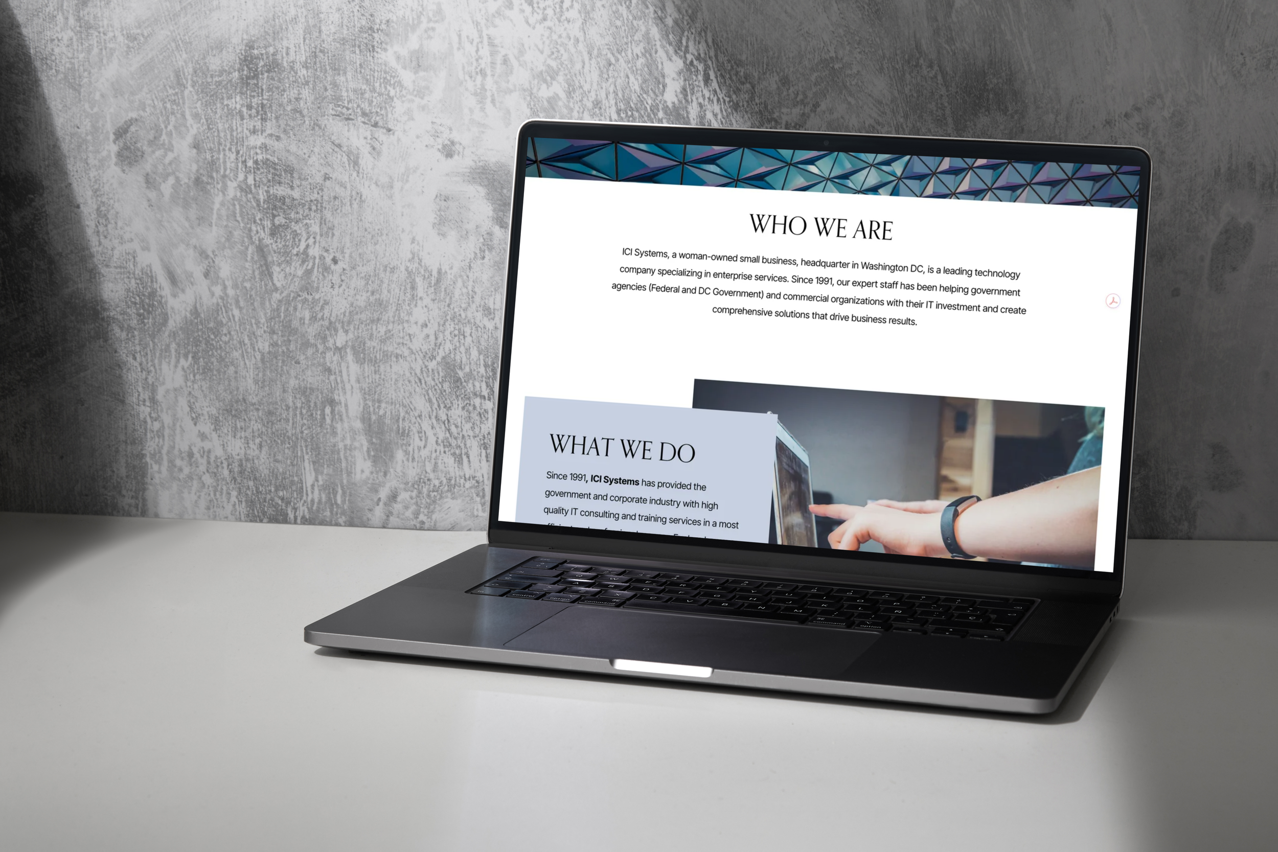
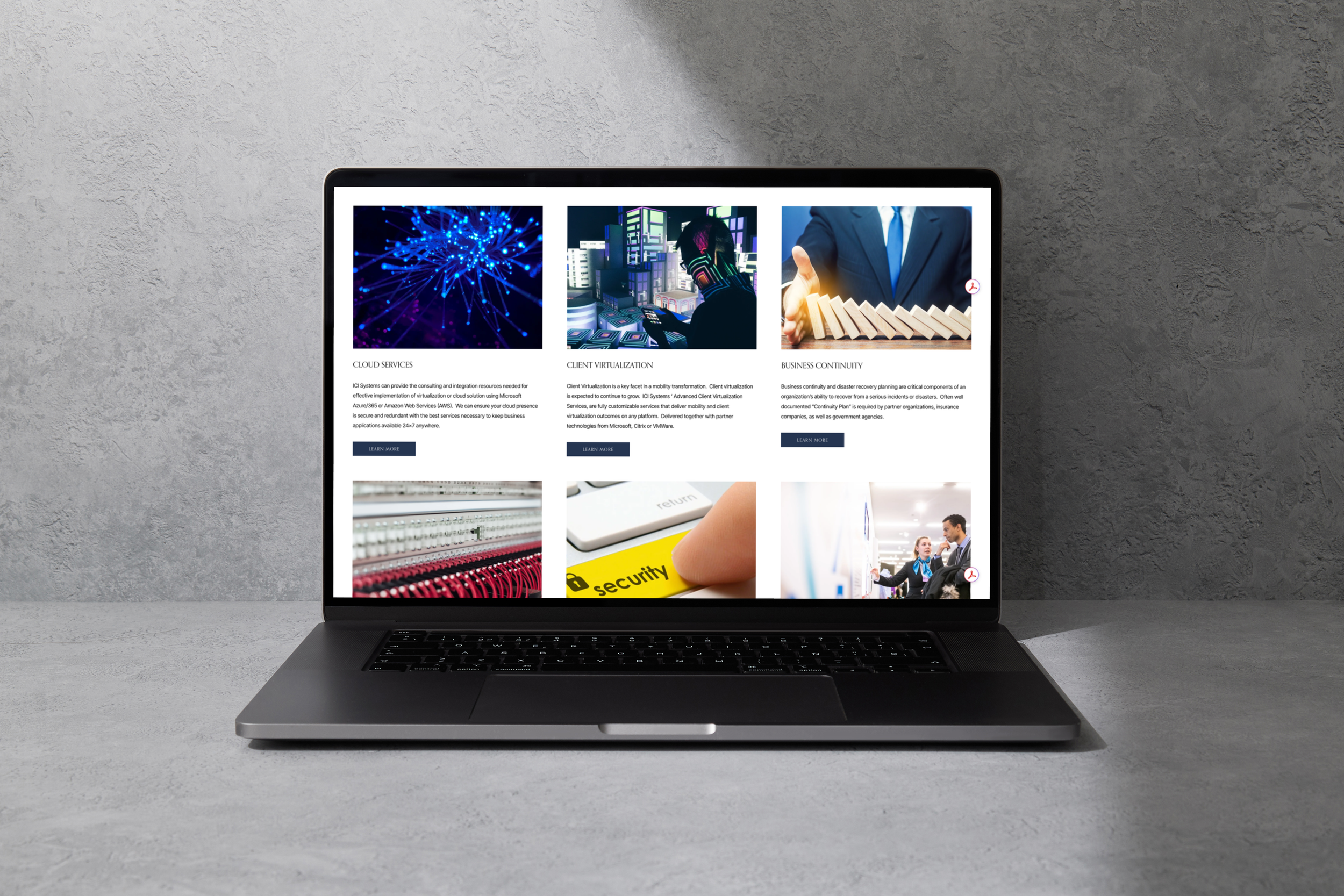
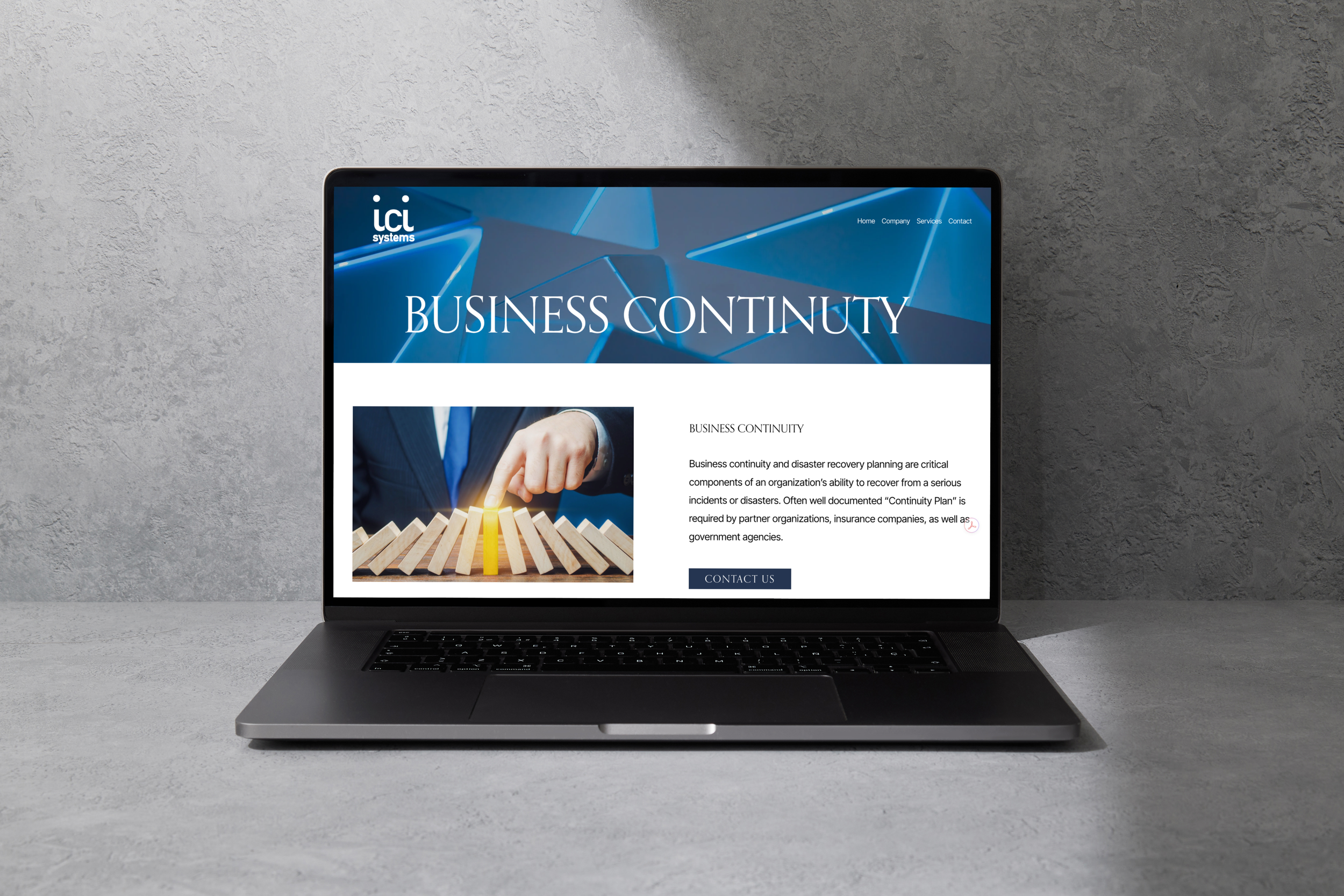
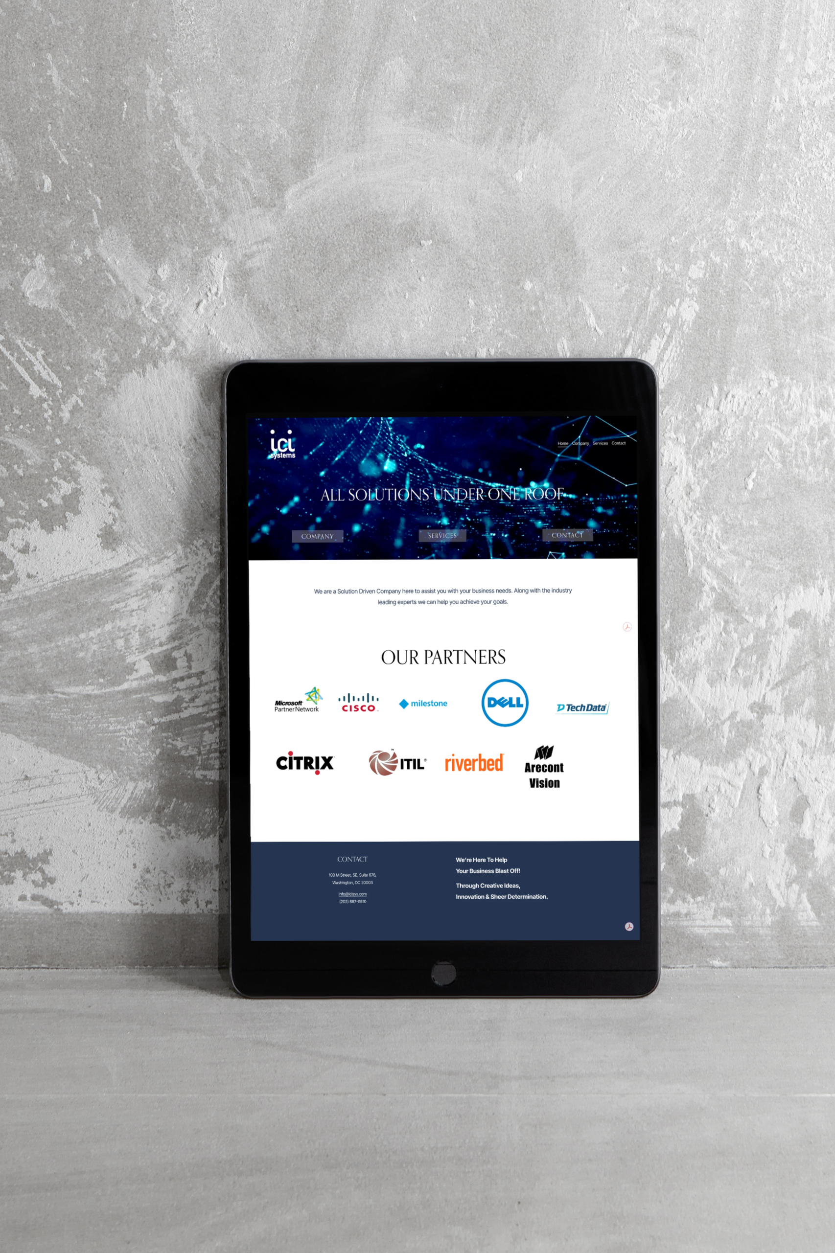
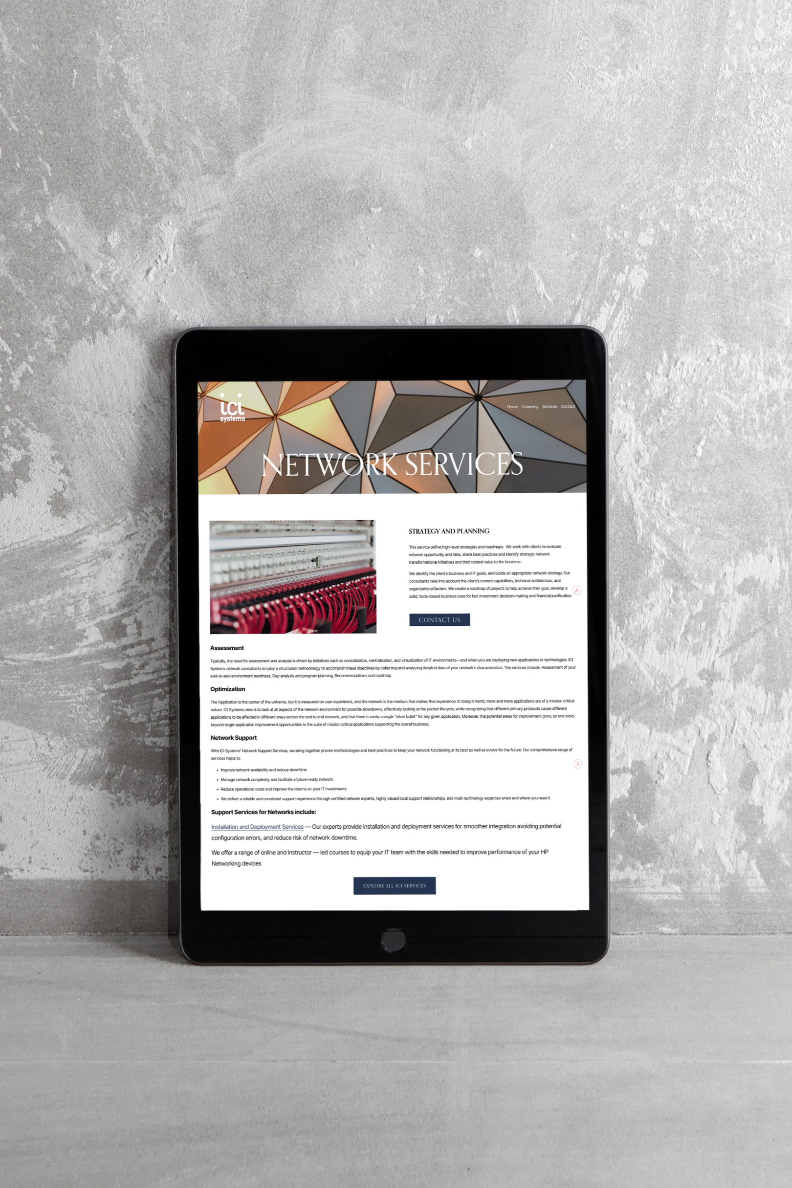
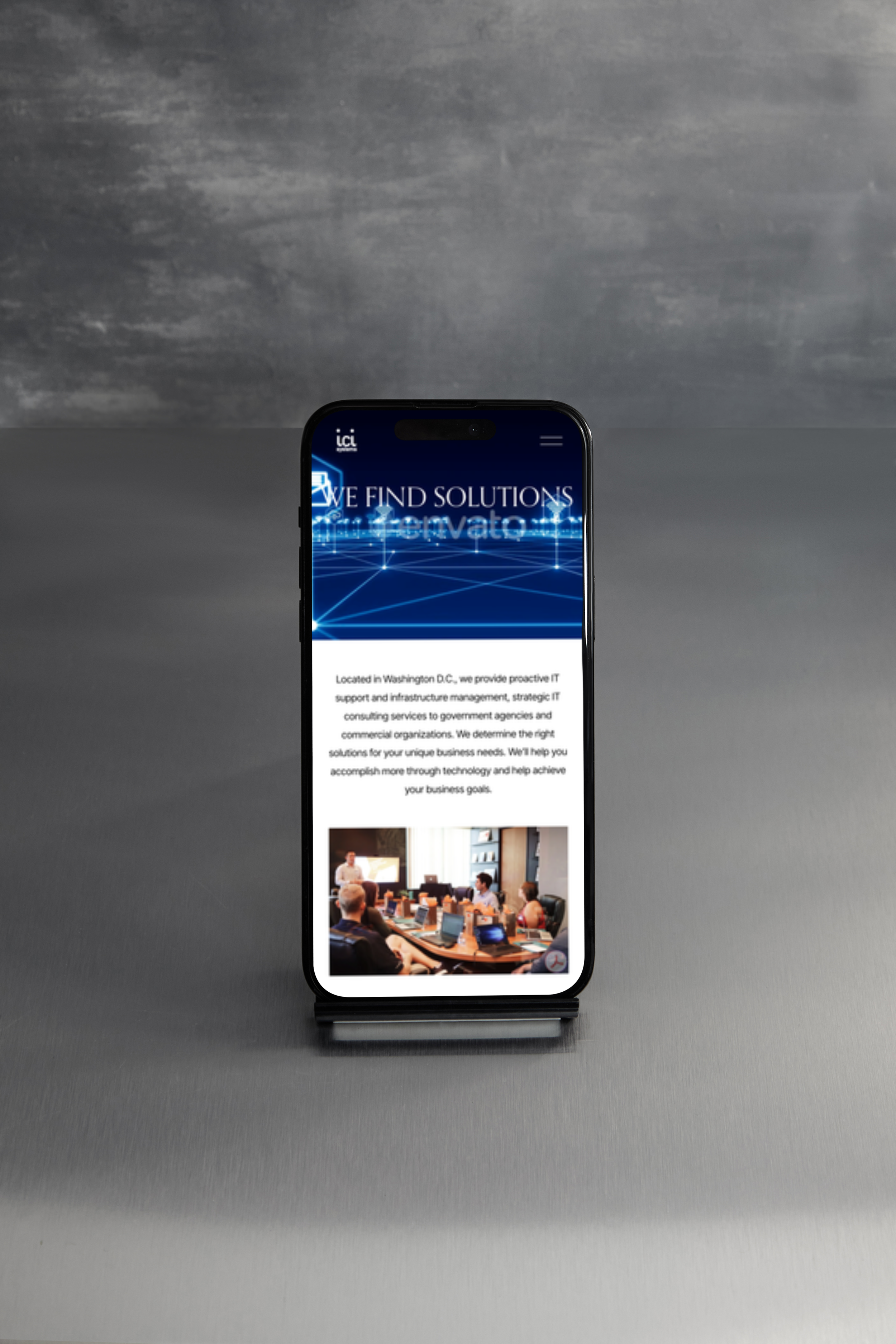
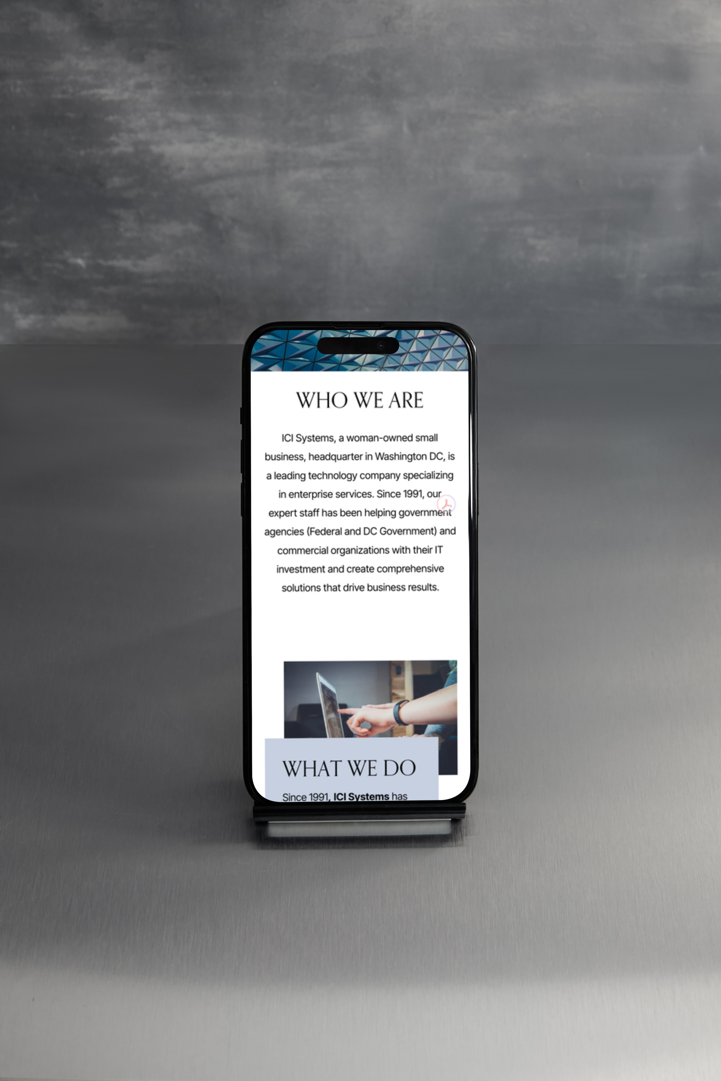
Visit the site at icisys.com
Modernizing the logo
The logo modernization required a careful balance. ICI Systems holds long-standing government contracts where brand recognition matters — the existing mark couldn't be unrecognizable to existing clients and partners. The update retained the core identity while bringing the typography and mark in line with current standards, making it credible alongside their industry partners Microsoft, Cisco, VMware, Amazon, and Citrix.

Original Logo
Redesigned Logo on dark BG
Redesigned Logo on light BG
Color Palette:
White — #FFFFFF
Light Gray — #E0E0DB
Navy Blue — #253551
Dark Charcoal — #2A2829
Black — #000000
Typography:
Headings — Orpheus Pro
Paragraphs — Inter Tight
Miscellaneous — Inter Tight